Popups. Love them or hate them, it’s hard to deny they’re everywhere. And while they’ve got a bit of a bad reputation for interrupting user experiences, they’re also one of the most effective tools to capture attention quickly when done right. But how do you create a popup that grabs attention without annoying visitors?
We’re about to share game-changing design tips that will turn your popups into an opportunity, not an irritant. Together, we’ll explore how to balance eye-catching design, a user-first approach, and flawless execution to ensure your website popups don’t just work—they shine.
By the end of this post, you’ll know how to leverage popups to boost engagement and conversions while keeping your visitors happy.
Why Website Popups Get a Bad Rap
Popups have become the internet’s boiling point of frustration. We’ve all run into popups that seem designed to annoy us—those poorly timed popups that block content or refuse to disappear no matter how much frantic clicking ensues.
But here’s the secret sauce you need to know: the problem isn’t popups themselves. It’s how they’re designed and implemented. Great popups fit seamlessly into the user experience, feel helpful instead of pushy, and add value to website visits.
When website design focuses on user needs rather than shoving a message in their face, a popup transforms from a nuisance to an asset. It’s all about making the experience as positive and frictionless as possible.
Now, roll up your sleeves. We’re breaking down the essential ingredients for creating effective, non-annoying popups you’ll love as much as your users will.
1. Get the Timing Right
Timing can make or break the success of your popup. Nothing turns users off faster than being interrupted before they’ve even had a chance to explore the page they came for. The key is to introduce your popup only when it makes sense in the user’s journey.
Best Practices for Popup Timing
Delay Triggers
Show your popup a few seconds after a visitor lands on your site. This gives users a chance to browse without immediate interruption. A good rule of thumb is a 5–10 second delay, but test to find the sweet spot tailored to your site’s average visit durations.

Exit-Intent Popups
Ever hovered over the close button, only to have a popup say, “Wait! Don’t leave!” That’s an exit-intent popup, and it’s powerful when used sparingly. It acts as a last call to action (like offering a discount or free resource) before the visitor exits your site.
Scroll-Triggered Popups
Want to make sure visitors have taken in some content before delivering your popup? Use a scrolling threshold as your trigger, such as once a visitor scrolls 50% of the page.
By aligning the timing with user behavior, your popup feels fluid and purposeful instead of awkward and intrusive.
2. Prioritize Clean, On-Brand Design
Ever seen a popup that looks like it was designed in 1999 and copied a spam email’s aesthetics? Using outdated, off-brand designs is a guaranteed way to lose your audience’s trust. Your popups should scream “quality” and reflect your brand’s personality while staying visually clean.
Design Elements That Work Wonders
Minimalistic Layouts
Avoid visual clutter. Stick to a simple layout with one key message and a clear call-to-action (CTA). Use whitespace generously to keep the focus where it belongs.
Eye-Friendly Fonts and Colors
Match your popup colors and fonts to your website’s design palette. This creates consistency and ensures your popup feels part of your site—not like it was added as an afterthought.
Mobile-First Design
On smaller screens, popups can dominate too easily or, worse, ruin usability by being hard to remove. Always test your designs on different devices to ensure mobile users have just as good an experience as desktop visitors.
3. Deliver Real Value
Not all popups are created equal—some tools persuade, while others repel. The difference? Value. People are happy to engage with popups if they’re rewarded with something genuinely helpful, exciting, or exclusive in return.
How to Create Value-Packed Popups
Offer an Irresistible Freebie
Whether it’s an eBook, exclusive discount, free trial, or checklist, a freebie is a great way to collect email addresses while adding value to your users. Just be sure what you’re offering aligns with your audience’s interests.
Keep the Promise Clear
Clarity is everything. For example, instead of “Subscribe now!” try something like “Subscribe to receive 20% off instantly.” Your audience will know exactly what they’re getting and why it matters to them.
Leverage Social Proof
If you’ve got glowing customer reviews or stats that showcase your success, weave them into your popup. Something like, “Join the 10,000+ customers who trust us” helps build credibility.
Built Effectively, Popups Can Be Game-Changers
At the heart of it all, popups don’t have to be those “ugh!” moments users dread. Designed thoughtfully, they’re tools for connection, engagement, and conversion. It starts with respecting the visitor experience by using timing, design, and value to strike the perfect balance.
And here’s the best part—you don’t need to figure it all out alone!

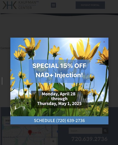
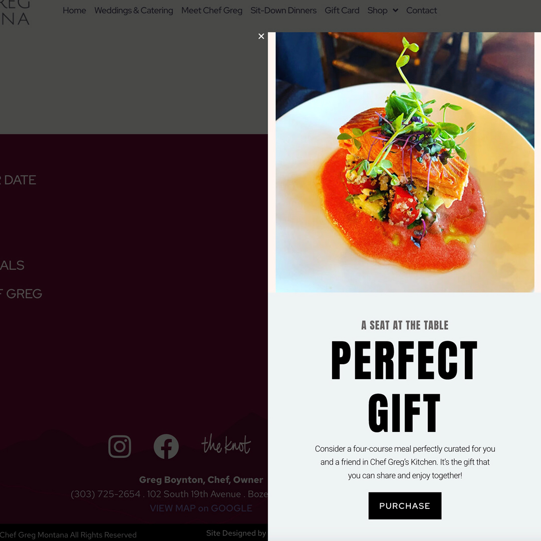
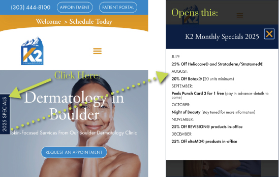
Desktop and mobile sizing — be sure to show your exit “X”.
FAQ
How do I prevent popups from hurting my SEO?
Search engines like Google frown upon intrusive popups, especially on mobile. To stay on Google’s good side, avoid full-screen popups that block your main content. Instead, use popups sparingly and ensure they’re easy to dismiss.
How many popups are too many?
Stick to one or two popups per visit to avoid overwhelming your visitors. More than that risks annoying users and spiking bounce rates.
Want to elevate your website’s engagement, conversions, and vibe? At DesignInk Digital, designing for success is our specialty. Whether you need A+ popups, sleek pages, or cutting-edge experiences, we’ve got your back. Let’s chat! and bring your vision to life today.