Your email list is one of the most powerful assets your business has. It’s a direct line to your most engaged audience—the people who have raised their hands and said, “Yes, I want to hear from you!” But building that list can feel like a huge challenge. How do you turn casual website visitors into loyal subscribers without being pushy? It all comes down to putting your sign-up forms in the right places.
Together, we’re going to explore the most effective spots on your website to place email opt-ins. We’ll show you how to seamlessly integrate these forms to grow your audience and build lasting customer relationships. Think of it as rolling out a welcome mat that invites people in, rather than putting up a billboard that shouts at them.
By the end of this guide, you’ll have a clear roadmap for transforming your website into a list-building powerhouse. Let’s get started and make some magic happen!
Why Strategic Placement Matters
Before we dive into the “where,” let’s talk about the “why.” You could have the most beautifully designed, enticing opt-in offer in the world, but if no one sees it, it won’t do you any good. Placing your opt-in forms in high-traffic, contextually relevant areas is the key to maximizing conversions. It’s about meeting your visitors where they are and presenting your offer at the exact moment they’re most likely to be interested.
Think about it from your visitor’s perspective. They land on your blog because they want to learn something. An opt-in at the end of a helpful post offering more great content feels like a natural next step. They visit your “About” page to get to know you better. An invitation to join your community feels personal and welcoming.
Strategic placement accomplishes a few wonderful things:
- It Increases Visibility: Placing forms in multiple, logical locations ensures more eyeballs see your offer.
- It Improves User Experience: When an opt-in feels helpful rather than intrusive, it enhances the visitor’s journey instead of disrupting it.
- It Boosts Conversion Rates: By aligning your offer with your visitor’s intent, you significantly increase the likelihood that they’ll sign up.
We believe in making every part of your website work for you. Let’s explore the five best places to add those high-converting email opt-ins.
The Top 5 Spots for Your Email Opt-Ins
Ready to turn your website into a subscriber-generating machine? Here are our five favorite, tried-and-true locations for email opt-in forms that deliver fantastic results. We’ll break down why each one works so well and how you can implement it for your own business.
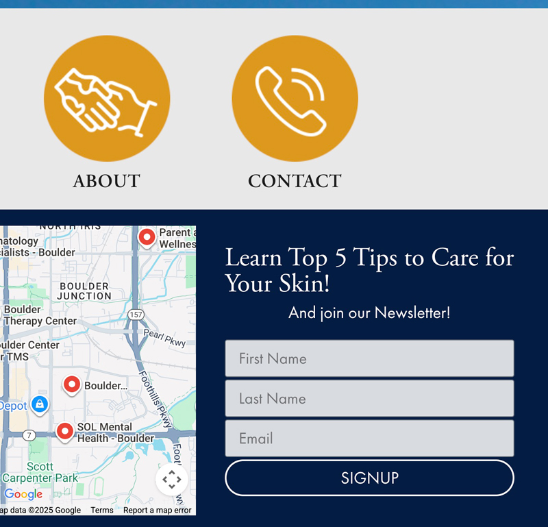
1. The Header or Navigation Bar
Your website’s header is prime real estate. It’s one of the first things visitors see, and it follows them from page to page. Placing a subtle yet clear call-to-action (CTA) here ensures your email list is always an option, no matter where a user navigates.
A “Subscribe” button or a simple sign-up link in your navigation bar is an unobtrusive way to keep your list top-of-mind. It doesn’t interrupt the user’s browsing experience but remains consistently available. This placement works because it capitalizes on moments of high engagement. For example, after a visitor reads a compelling blog post or learns about your services, their next natural glance is often toward the navigation to decide what to do next. Seeing a “Join Our Community” link right there makes signing up an easy, split-second decision. It’s a quiet but powerful invitation that works around the clock.
2. Within Your Blog Content
Your blog is where you build authority and provide immense value to your audience. It’s the perfect environment to ask for an email address in return. Visitors who are actively reading your posts are already engaged and interested in what you have to say. By integrating an opt-in form directly within your content, you can capture their attention at its peak.
There are a couple of ways to do this effectively:
- In-Line Forms: Place a simple form a few paragraphs into your post. This works best when the form is directly related to the content. For example, if you’re writing about social media tips, your in-line form could offer a free social media content calendar.
- Content Upgrades: This is a supercharged version of an in-line form. A content upgrade is a bonus resource—like a checklist, template, or printable PDF—that complements the blog post. You offer it in exchange for an email. It’s incredibly effective because it provides immediate, specific value related to what the reader is already interested in.
3. The Website Footer
Much like the header, your website’s footer appears on every single page. People instinctively scroll down to the footer to find contact information, social media links, and other key details. It’s a natural endpoint for their browsing journey on any given page, making it a fantastic, non-intrusive spot for an email opt-in.
A footer sign-up form is the perfect “last chance” CTA. It catches visitors who have scrolled all the way to the bottom, signaling a high level of interest in your content or company. They’ve consumed your page, and now you’re offering them a simple way to stay connected. Keep the form simple—just a field for an email address and a compelling button like “Stay in the Loop” or “Get Updates.” It’s a low-pressure, high-impact addition that consistently brings in new subscribers.

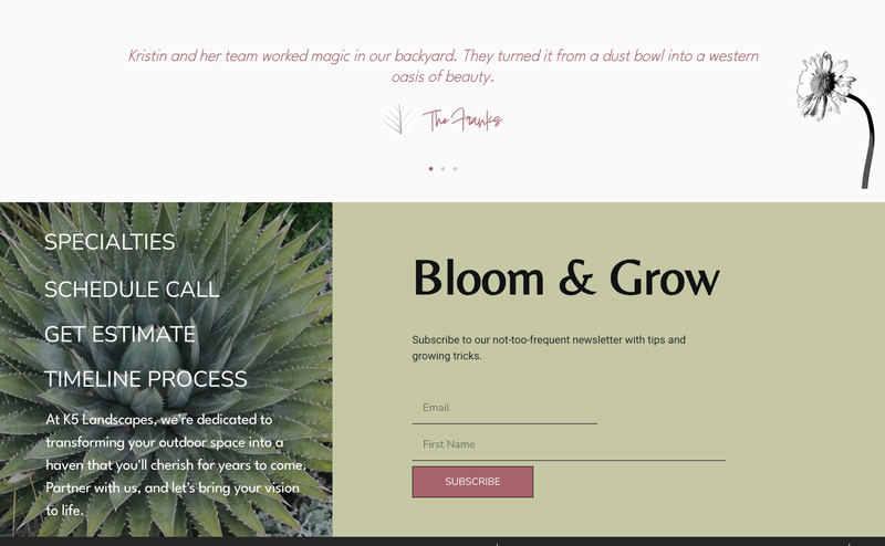
4. Your “About” Page
Your “About” page is one of the most visited pages on your site. People go there to connect with the human side of your brand. They want to know your story, your mission, and the people behind the business. This creates a powerful moment of connection, and it’s an ideal time to invite them to become part of your community.
Placing an opt-in form on this page feels personal and genuine. After sharing your story and what drives you, you can frame the invitation as a way to continue the conversation. Use language that emphasizes community and connection, like “Join our journey” or “Become an insider.” This approach turns a simple sign-up into a meaningful act of joining a tribe, making it far more compelling than a generic subscription box. It shows you don’t just want their email; you want to build a relationship.
5. Exit-Intent Pop-Ups
Okay, let’s talk about pop-ups. We know they can have a bad reputation, but when used correctly, exit-intent pop-ups are one of the most effective list-building tools available. Unlike disruptive pop-ups that appear immediately, an exit-intent pop-up is triggered only when a visitor is about to leave your site. It works by tracking mouse movement, and when the cursor heads toward the “close” or “back” button, the pop-up appears.
This is your final opportunity to capture a visitor’s attention and offer them something valuable before they go. The key to success is a compelling offer. Don’t just ask them to subscribe to your newsletter. Instead, offer an exclusive discount, a free guide, a webinar invitation, or another irresistible lead magnet. Because you’re catching them on their way out, you have nothing to lose and a new subscriber to gain. When you are looking to implement the email opt-ins your website needs, this one is a game-changer.
Putting It All Together for Maximum Impact
Now that you know the best places to add your email opt-ins, the next step is implementation. Start by choosing two or three of these locations to test. You don’t need to use all five at once! The goal is to create a seamless system that works for your unique audience and website design. Remember to pair each opt-in form with a compelling reason for someone to subscribe. What’s in it for them? Whether it’s exclusive content, a discount, or helpful tips, always lead with value.
Growing your email list is a marathon, not a sprint. By strategically placing your opt-in forms, you create more opportunities to connect with your audience and build a loyal community around your brand. We’re excited to see you put these tips into action and watch your email list flourish!
Frequently Asked Questions (FAQ)
Q: How many opt-in forms are too many on one page?
A: Great question! While there’s no magic number, a good rule of thumb is to avoid overwhelming your visitor. Typically, two to three strategically placed opt-ins per page (e.g., header, in-content, and footer) is a solid strategy. The key is to make them feel natural and helpful, not cluttered or aggressive.
Q: Should my opt-in forms all have the same offer?
A: Not necessarily! Tailoring your offer to the context is a brilliant move. For example, a blog post about SEO could offer an SEO checklist, while your “Services” page could offer a free consultation. Customizing your offers makes them more relevant and much more effective.
The team at DesignInk Digital is a small and mighty creative force dedicated to helping your business thrive. We work with you, not just for you, to build vibrant strategies and deliver reliable execution. From web design to digital marketing, we sweat the details so you can shine. Schedule your FREE consultation today!